[Reference] FIRE - immunity data transformations
May 18, 2014
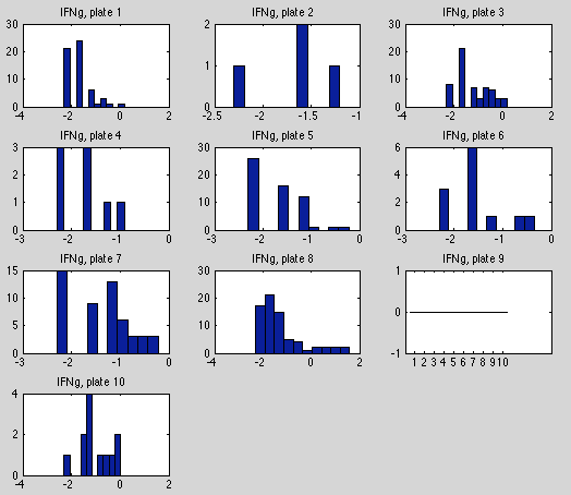
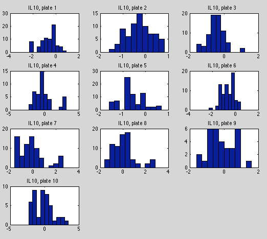
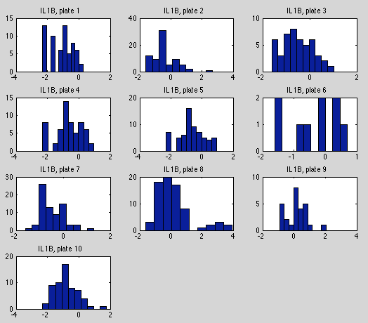
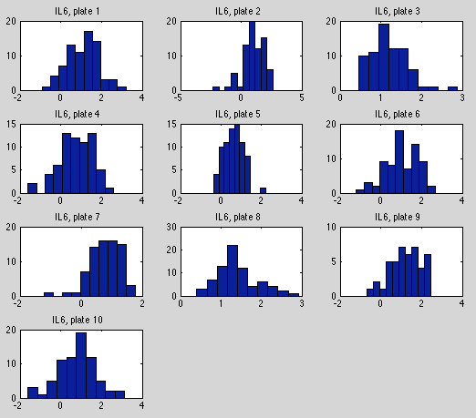
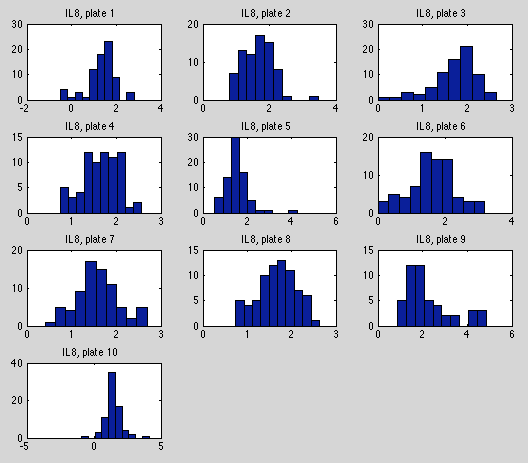
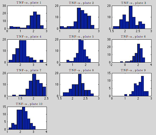
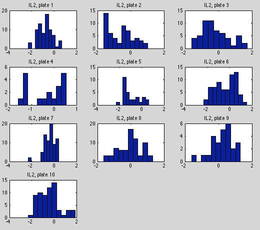
this is a follow-up to [this earlier post], in which immunity data is plotted as histograms for each "plate".
After log-transforming the variables the extreme outliers now look more sensible, and the distributions are far more symmetric, with the exception of a few TNF-alpha plates.
Posted by Kyle Simek
